The Toolbar API has been available for a considerable period, having been introduced with the release of iOS 14. It was a valuable addition to the SwiftUI framework, enabling developers to incorporate menu items in the navigation and bottom bars. In iOS 16, Apple unveiled additional modifiers to further enhance the customization of toolbars and provide developers with greater control over their appearance.
In this tutorial, let me show you how to work with toolbars and manage its customizations.
Using the Toolbar Modifier to Populate Navigation Bar Items
Whether you need to populate items in navigation bars or toolbars, you can utilize the .toolbar modifier to achieve this objective. Here is an example:
|
1 2 3 4 5 6 7 8 9 10 11 12 13 14 15 16 17 18 19 20 21 22 23 24 25 26 27 28 29 30 31 |
struct ContentView: View { var body: some View { NavigationStack { List(1..<10, id: \.self) { index in NavigationLink(“Item \(index)“) { Image(“legomen”) .resizable() .ignoresSafeArea() } }
.navigationTitle(“Toolbar Demo”)
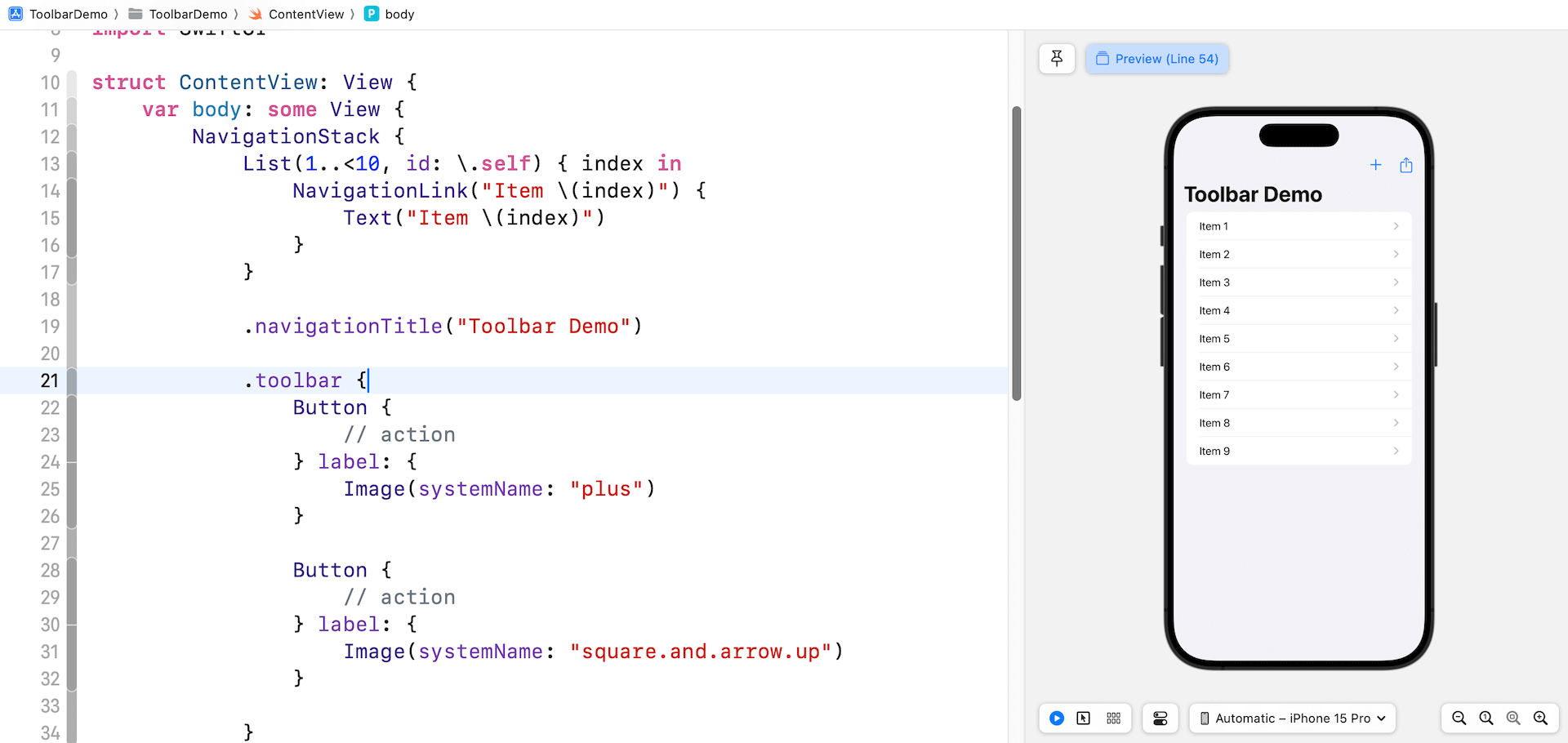
.toolbar { Button { // action } label: { Image(systemName: “plus”) }
Button { // action } label: { Image(systemName: “square.and.arrow.up”) }
} }
} } |
Inside the closure of toolbar, we create a pair of standard buttons using system images. Without explicitly specifying the placement of the buttons, SwiftUI automatically positions them in the top-right corner of the navigation bar.

Using ToolbarItem
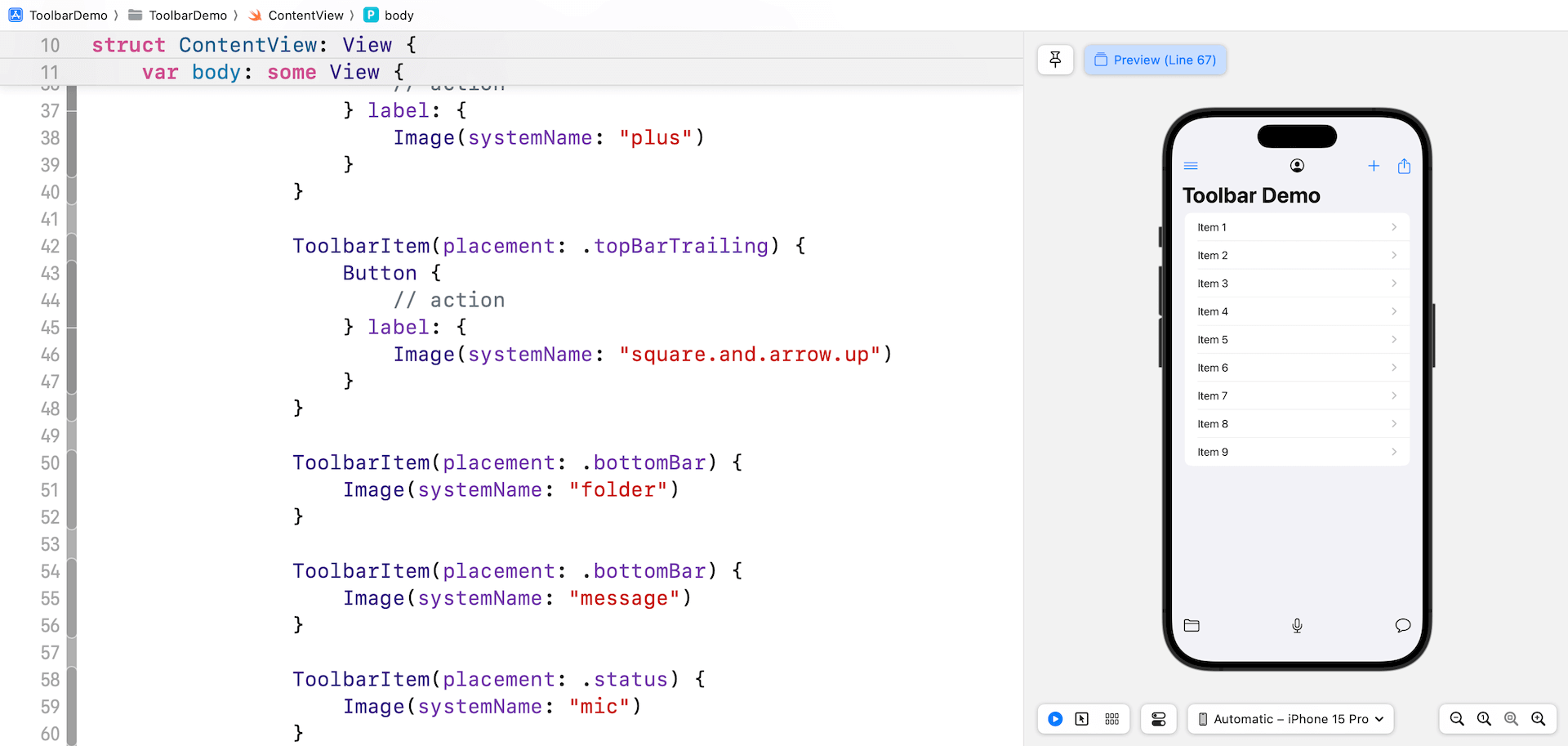
If you need to add more items to the navigation bar, you can continue to add buttons in the toolbar closure. However, if you want to control the placement of the items, you can provide a collection of views with each view wrapped in a ToolbarItem. Below is an example:
|
1 2 3 4 5 6 7 8 9 10 11 12 13 14 15 16 17 18 19 20 21 22 23 24 25 26 27 28 29 30 31 32 33 34 35 36 37 38 39 40 41 42 43 44 45 46 47 |
.toolbar { ToolbarItem(placement: .principal) { Image(systemName: “person.crop.circle”) }
ToolbarItem(placement: .topBarLeading) { Button { // action } label: { Image(systemName: “line.3.horizontal”) } }
ToolbarItem(placement: .topBarTrailing) { Button { // action } label: { Image(systemName: “plus”) } }
ToolbarItem(placement: .topBarTrailing) { Button { // action } label: { Image(systemName: “square.and.arrow.up”) } }
ToolbarItem(placement: .bottomBar) { Image(systemName: “folder”) }
ToolbarItem(placement: .bottomBar) { Image(systemName: “message”) }
ToolbarItem(placement: .status) { Button {
} label: { Text(“Hide Navigation”) } .buttonStyle(.borderedProminent) .controlSize(.extraLarge) } } |
Each ToolbarItem enables you to define the position of the item by utilizing the placement parameter. To add items in the navigation bar, you can specify the following values:
.topBarLeading– Places the item in the leading edge of the top bar..topBarTrailing– Places the item in the trailing edge of the top bar..principle– Places the item in the principal item section,which is the center of the navigation bar.
To add items in the bottom bar, you can set the value to .bottomBar and .status:
.bottomBar– Places the item in the bottom toolbar..status– In iOS and iPadOS, the system places status items in the center of the bottom toolbar.

How to Hide the Navigation Bar and Bottom Bar
Starting from iOS 16, the toolbar modifier offers developers the ability to manage the visibility of toolbars, including the navigation bar and bottom bar. To hide the navigation bar, you can insert the toolbar modifier inside NavigationStack like this:
|
.toolbar(.hidden, for: .navigationBar) |
If you want to provide an option for users to hide/show the navigation bar, you can declare a state variable like below:
|
@State private var showNavBar = true |
Then you can update the .toolbar modifier like this:
|
1 2 3 4 5 6 7 8 9 10 11 12 13 14 15 16 17 18 |
.toolbar {
. . .
ToolbarItem(placement: .status) { Button { showNavBar.toggle() } label: { Text(showNavBar ? “Hide Navigation” : “Show Navigation”) } .buttonStyle(.borderedProminent) .controlSize(.extraLarge) } } .toolbar(showNavBar ? .visible : .hidden, for: .navigationBar) .animation(.easeInOut, value: showNavBar) |
To hide the visibility of the bottom bar, you can replace .navigationBar with .bottomBar. Here is an example:
|
.toolbar(.hidden, for: .bottomBar) |
Controlling the Visibility of Toolbar Background
SwiftUI offers another modifier called toolbarBackground for developers to control the visibility of the toolbar background. To make the navigation bar background transparent, you can set the value of toolbarBackground to .hidden:
|
.toolbarBackground(.hidden, for: .navigationBar) |
To make the background visible, you can set the value to .visible. Here is an example:
|
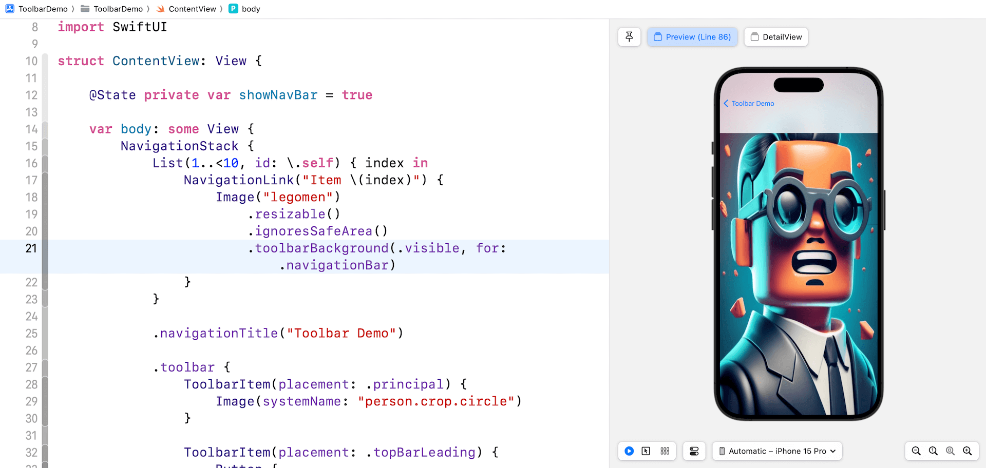
List(1..<10, id: \.self) { index in NavigationLink(“Item \(index)“) { Image(“legomen”) .resizable() .ignoresSafeArea() .toolbarBackground(.visible, for: .navigationBar) } } |
After making the code changes, you should see a navigation bar with a blurred background when navigating to the detail view.

Toolbar Color Scheme
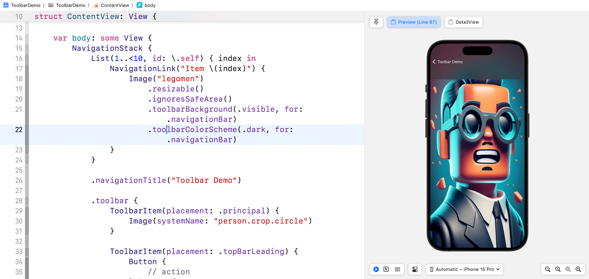
You can exert additional control over the color scheme of the navigation bar or bottom bar by employing the toolbarColorScheme modifier. For instance, to apply dark mode to the navigation bar of the detail view, you can apply the toolbarColorScheme modifier to the Image view as demonstrated below:
|
.toolbarColorScheme(.dark, for: .navigationBar) |
Now, when you navigate to the detail view, the navigation bar changes to dark mode.

Summary
Throughout this tutorial, we have covered the fundamentals of the Toolbar APIs and explored how to populate items in toolbars. As the SwiftUI framework continues to evolve, it offers developers an expanded range of functionalities to customize the appearance of navigation and bottom bars. These advancements enable developers to create more visually appealing and tailored user interfaces in their SwiftUI apps.
If you want to learn more about SwiftUI, you can check out our Mastering SwiftUI book. It’s now fully updated for Xcode 15 and iOS 17.


