When it comes to designing visually appealing and intuitive user interfaces in iOS development, SF Symbols are an invaluable asset. It offers a comprehensive library of over 5,000 customizable icons, designed specifically for iOS and macOS applications. The latest iOS 17 update brings SF Symbols 5, which introduces a fantastic collection of expressive animations. SwiftUI offers developers the ability to leverage these animations using the new symbolEffect modifier.
This feature empowers developers to create diverse and captivating animations within their apps. By incorporating symbolEffect into your SwiftUI code, developers can enhance user interactions and create visually engaging interfaces. In this tutorial, we will show you how to work with this new modifier to create various types of animations.
The Basic Usage of SymbolEffect
To animate a SF symbol, you can attach the new symbolEffect modifier to the Image view and specify the desired animation type. Here is an example:
|
struct ContentView: View { @State private var animate = false
var body: some View { Image(systemName: “ellipsis.message”) .font(.system(size: 100)) .symbolRenderingMode(.palette) .foregroundStyle(.purple, .gray) .symbolEffect(.bounce, value: animate) .onTapGesture { animate.toggle() } } } |
There are a number of built-in animations including Appear, Disappear, Bounce, Scale, Pulse, Variable Color, and Replace. In the code above, we use the bounce animation. So, when you tap the symbol in the preview canvas, it shows a bouncing effect.

Make it Repeatable
By default, the animation is only played once. To make it repeatable, you can set the options parameter of the modifier to .repeating like this:
|
.symbolEffect(.bounce, options: .repeating, value: animate) |
This will achieve an animated effect that repeats indefinitely. If you desire to repeat the effect for a specific number of times, you can utilize the .repeat function and indicate the desired repeat count as shown below:
|
.symbolEffect(.bounce, options: .repeat(5), value: animate) |
Controlling the animation speed

In addition, you have the flexibility to customize the animation speed by utilizing the .speed function within the options parameter. For instance, if you wish to slow down the animation, you can set the value of the .speed function to 0.1, as demonstrated below:
|
.symbolEffect(.bounce, options: .speed(0.1), value: animate) |
Animation Types
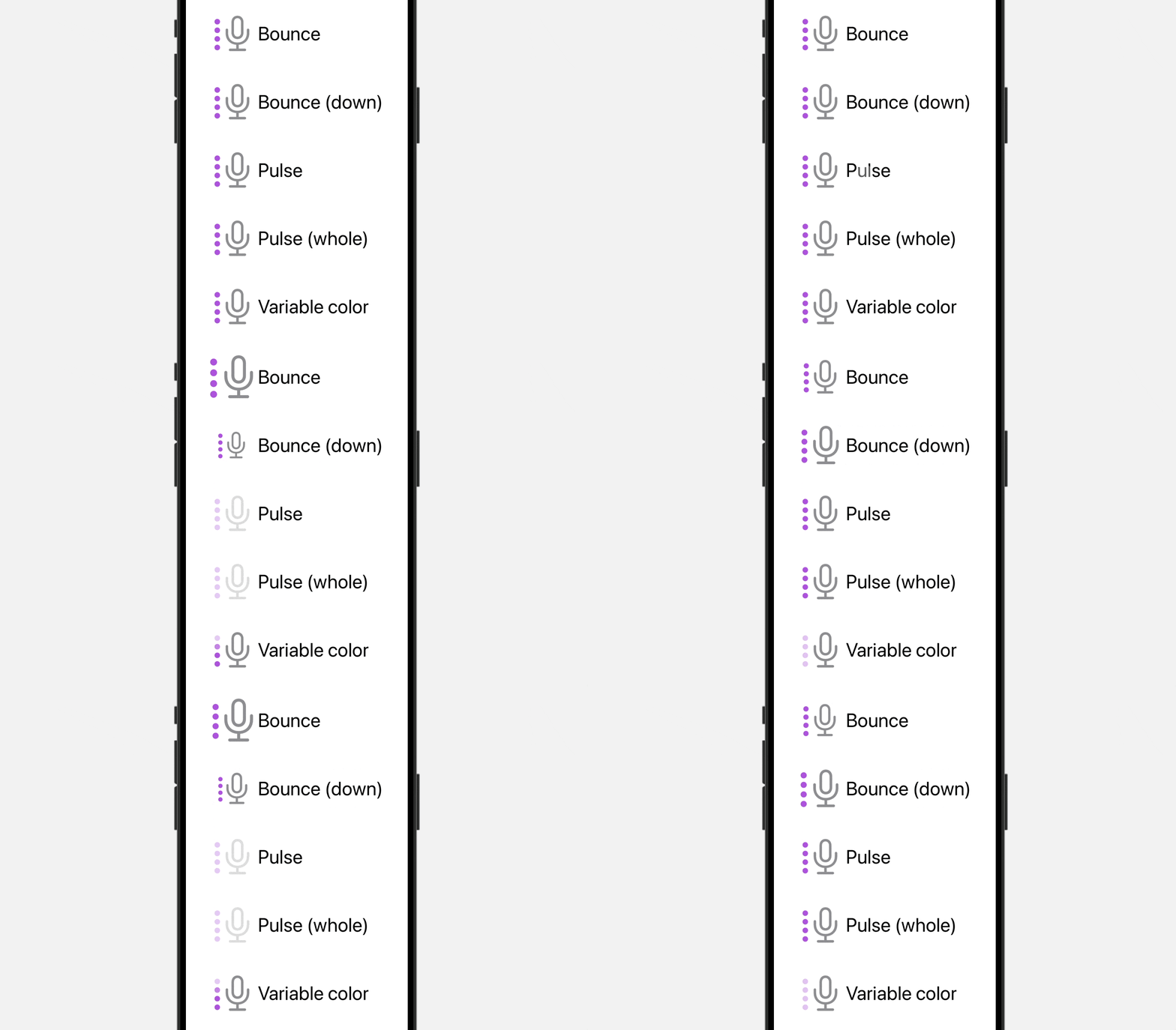
As stated earlier, SwiftUI provides a variety of built-in animation types, such as Bounce, Scale, Pulse, Variable Color, and Replace. Up until now, we have exclusively used the bounce animation. Now, let’s explore and test out other animation types using the provided code snippet:
|
1 2 3 4 5 6 7 8 9 10 11 12 13 14 15 16 17 18 19 20 21 22 23 24 25 26 27 28 29 30 31 32 33 34 35 36 37 38 39 40 41 42 43 44 45 46 47 48 49 50 51 52 53 54 55 56 57 58 59 60 61 |
struct SymbolAnimationView: View { @State private var animate = false
var body: some View { VStack(alignment: .leading, spacing: 50) { HStack { Image(systemName: “mic.and.signal.meter”) .font(.system(size: 60)) .symbolRenderingMode(.palette) .foregroundStyle(.purple, .gray) .symbolEffect(.bounce, options: .repeating, value: animate) Text(“Bounce”) .font(.largeTitle) }
HStack { Image(systemName: “mic.and.signal.meter”) .font(.system(size: 60)) .symbolRenderingMode(.palette) .foregroundStyle(.purple, .gray) .symbolEffect(.bounce.down, options: .repeating, value: animate) Text(“Bounce (down)”) .font(.largeTitle) }
HStack { Image(systemName: “mic.and.signal.meter”) .font(.system(size: 60)) .symbolRenderingMode(.palette) .foregroundStyle(.purple, .gray) .symbolEffect(.pulse, options: .repeating, value: animate) Text(“Pulse”) .font(.largeTitle) }
HStack { Image(systemName: “mic.and.signal.meter”) .font(.system(size: 60)) .symbolRenderingMode(.palette) .foregroundStyle(.purple, .gray) .symbolEffect(.pulse.wholeSymbol, options: .repeating, value: animate) Text(“Pulse (whole)”) .font(.largeTitle) }
HStack { Image(systemName: “mic.and.signal.meter”) .font(.system(size: 60)) .symbolRenderingMode(.palette) .foregroundStyle(.purple, .gray) .symbolEffect(.variableColor, options: .repeating, value: animate) Text(“Variable color”) .font(.largeTitle) }
} .onTapGesture { animate.toggle() } } } |
By tapping any of the images in the preview canvas, you can see the animations coming to life. In comparison to the bounce animation, the Pulse animation offers a distinct effect by gradually fading the opacity of specific or all layers within the image. On the other hand, the variableColor animation replaces the opacity of variable layers in the image, providing a unique visual transformation.

Even for the Bounce animation, you can specify .bounce.down to bounce the symbol downward.
|
.symbolEffect(.bounce.down, options: .repeating, value: animate) |
For added flexibility, it is possible to apply multiple symbolEffect modifiers to a view, allowing you to achieve a custom effect by combining different animations.
|
Image(systemName: “ellipsis.message”) .font(.system(size: 100)) .symbolRenderingMode(.palette) .foregroundStyle(.purple, .gray) .symbolEffect(.bounce, options: .speed(1.5), value: animate) .symbolEffect(.pulse, options: .repeating, value: animate) .onTapGesture { animate.toggle() } |
Content Transition and Replace Animation

In certain scenarios, there may be a need to transition between different symbols within an image. For instance, when a user taps the Touch ID symbol, it transforms into a checkmark symbol. To ensure a seamless and visually pleasing transition, you can utilize the contentTransition modifier in conjunction with the Replace animation, as demonstrated below:
|
Image(systemName: animate ? “checkmark.circle” : “touchid”) .font(.system(size: 100)) .symbolRenderingMode(.palette) .symbolEffect(.bounce, value: animate) .contentTransition(.symbolEffect(.replace)) .foregroundStyle(.purple, .gray) .onTapGesture { animate.toggle() } |
Summary
SF Symbols and symbolEffect provide developers with powerful tools to enhance user interactions and create visually engaging interfaces in iOS and macOS applications.
This tutorial demonstrates the basic usage of symbolEffect, making animations repeatable, controlling animation speed, and exploring different animation types. It also covers content transition and replace animation.
If you have found this tutorial enjoyable and would like to explore SwiftUI further, we highly recommend checking out our comprehensive book, “Mastering SwiftUI.“


